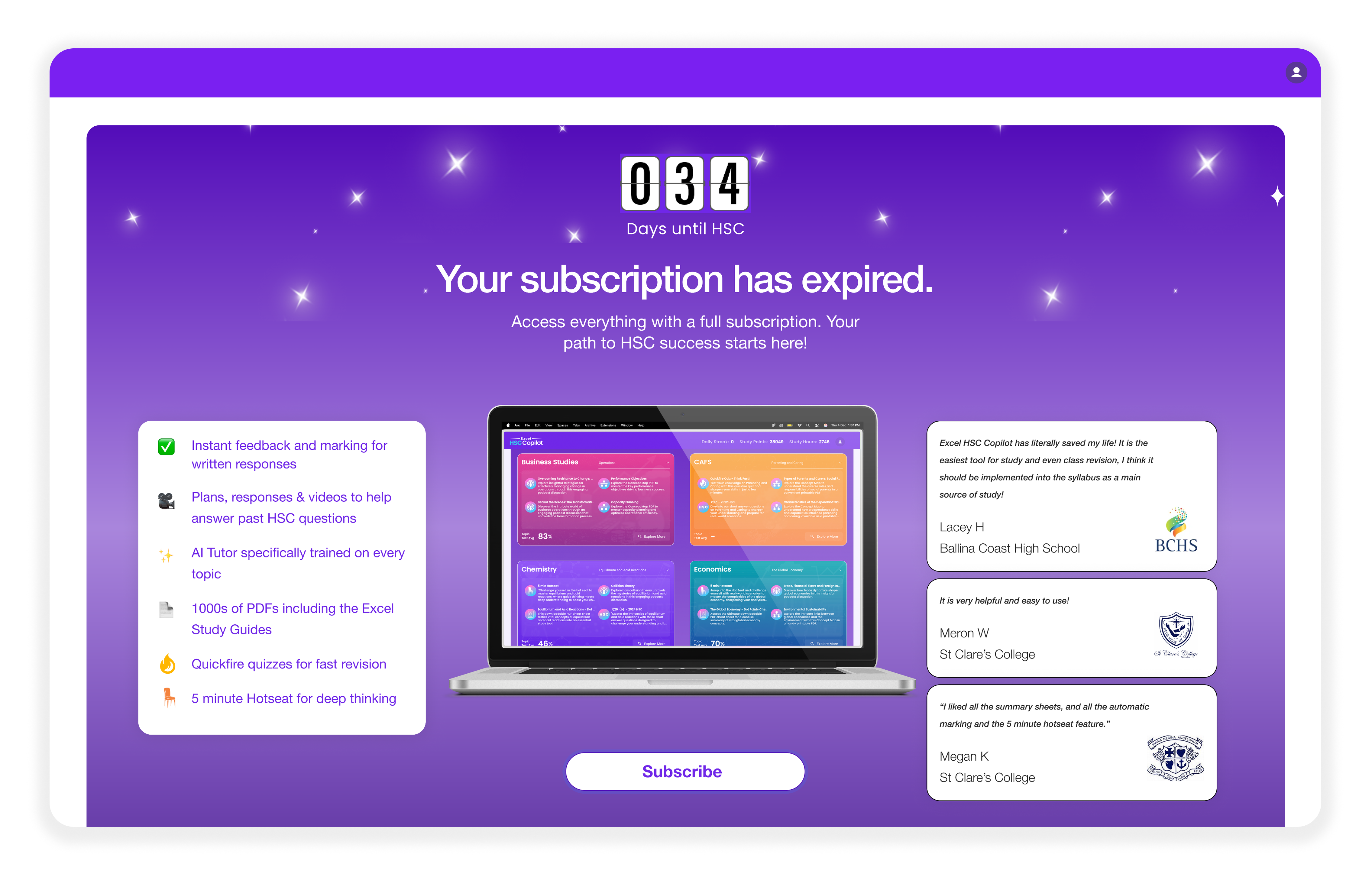
AI study platform for Australian high-school students
Year2024
RoleUI/UX Designer
Location33.8688° S, 151.2093° E
DisciplinesUI/UX Design, Web Design, Product Design
Excel HSC Copilot is an AI-powered study platform helping Australian high-school students prepare for HSC exams through practice tools, instant feedback, and guided learning. I worked on both the public website and internal study programs, focusing on clarity, usability, and consistency across the entire experience.
01
Overview
Excel HSC Copilot is an AI-powered study platform helping Australian high-school students prepare for HSC exams through practice tools, instant feedback, and guided learning.
I worked on both the public website and internal study programs, focusing on clarity, usability, and consistency across the entire experience.
02
My Role
I was the sole UI/UX designer on the project, working closely with developers.
My responsibilities included:
• Website UI/UX (homepage & key sections)
• Internal product UX flows
• Feature-level UI design (Quick Fire, study modules, profile section)
• Interaction & layout decisions
• Visual consistency across website and product
03
The Problem
From a UX standpoint, the product faced three key challenges:
1. Value Clarity
The website did not clearly communicate what the product does within the first few seconds, especially its AI-driven value.
2. Cognitive Overload
Internal tools presented dense information, which could overwhelm students during study sessions.
3. Inconsistency
The website and internal tools felt visually and experientially disconnected, reducing trust and clarity.
04
Goals
• Communicate product value clearly and quickly
• Reduce friction in key student workflows
• Make internal tools feel focused and approachable
• Create a cohesive design language across the ecosystem
• Design for stressed, time-constrained students
• Increase subscription conversions
05
Process & Thinking
I approached this project with a clarity-first mindset.
Key principles:
• Progressive disclosure over information dumping
• Strong hierarchy to guide attention
• Minimal UI to reduce anxiety during study
• Familiar interaction patterns to lower learning curves
06
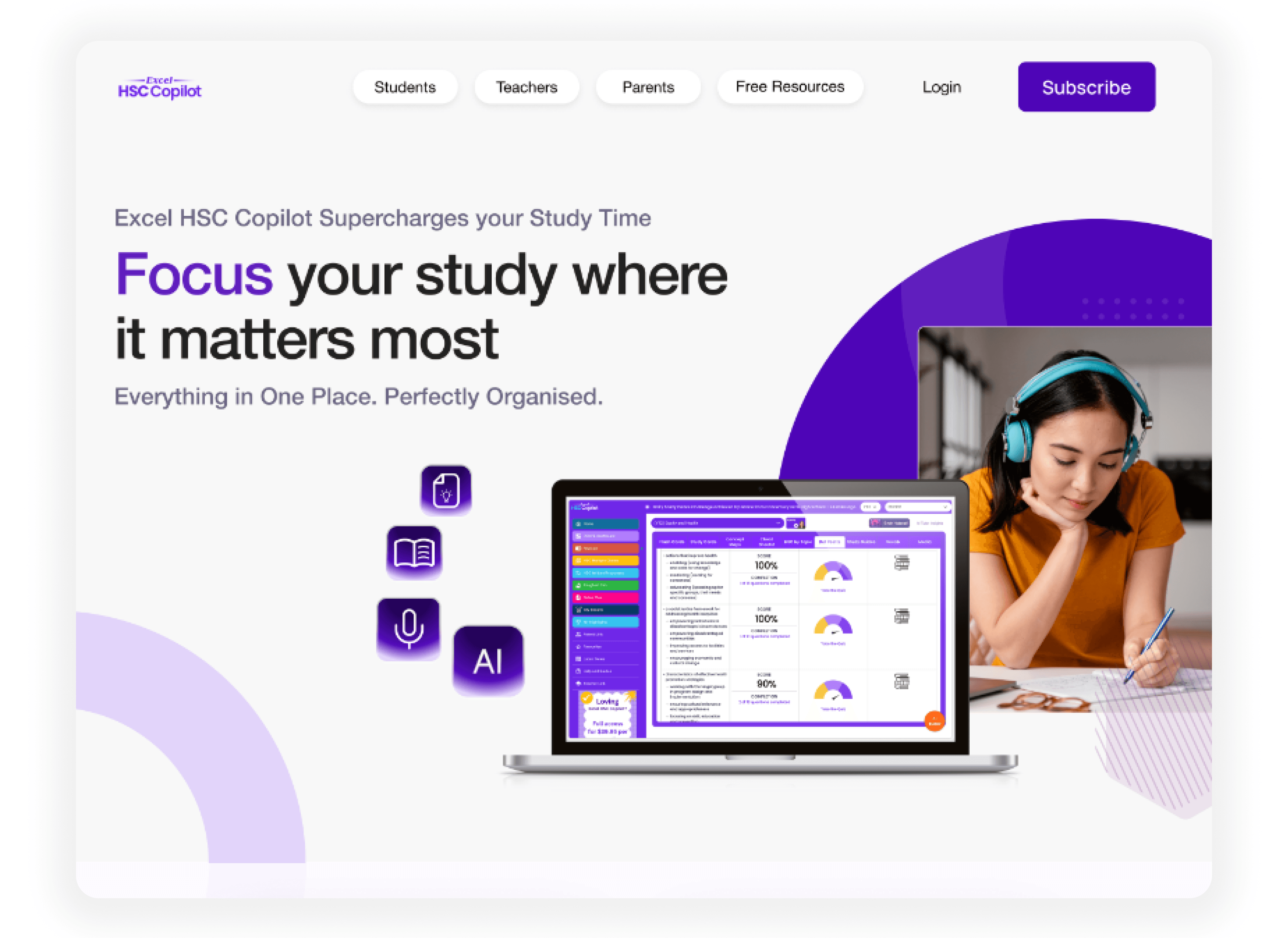
Website Design
What I worked on:
• Homepage layout and content hierarchy
• Feature storytelling and visual flow
• Clear CTAs and scannable sections
Design decisions:
• Hero section answers what, who, why immediately
• Content structured to move users from awareness → trust → action
• Visual alignment with internal product UI
07
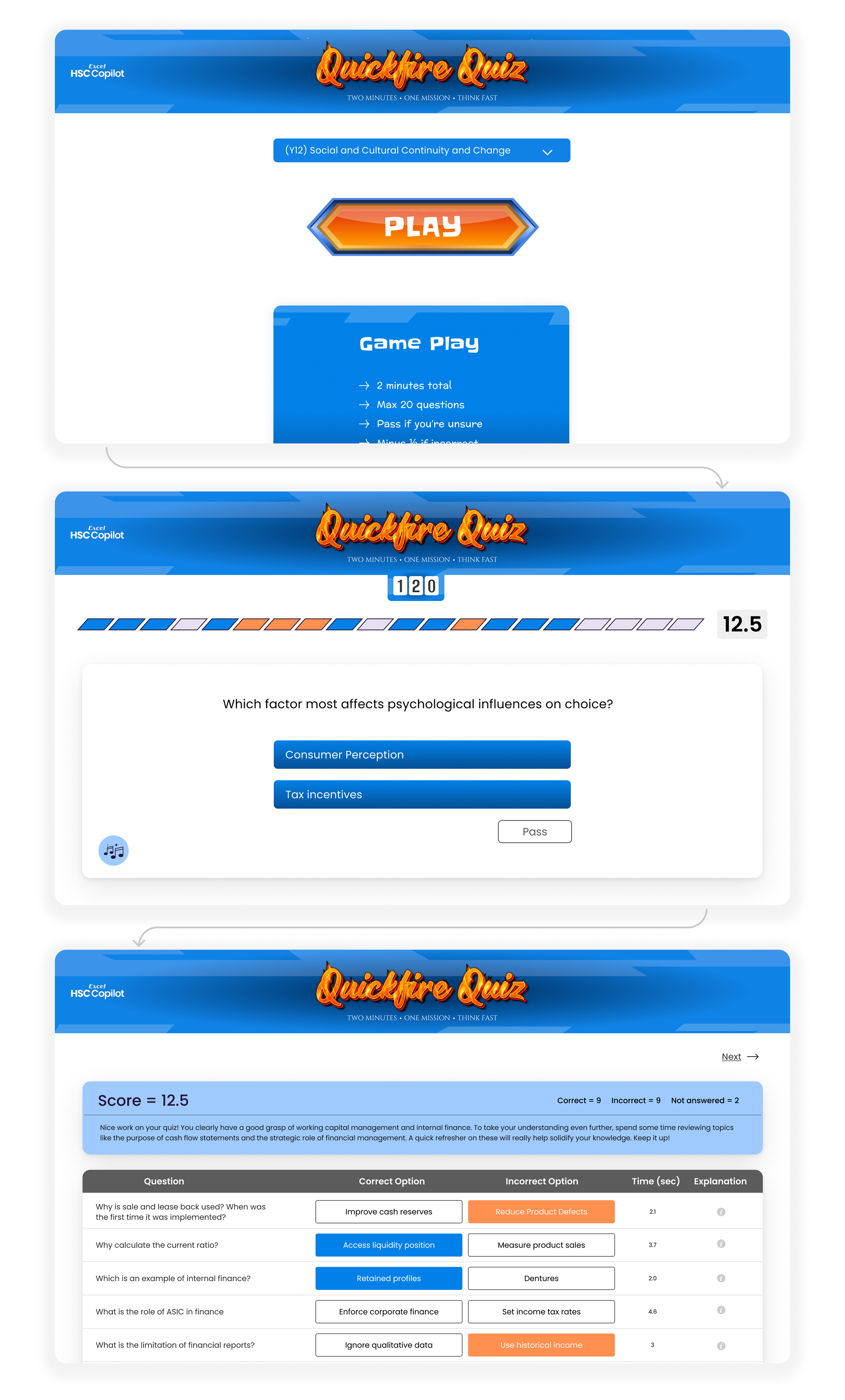
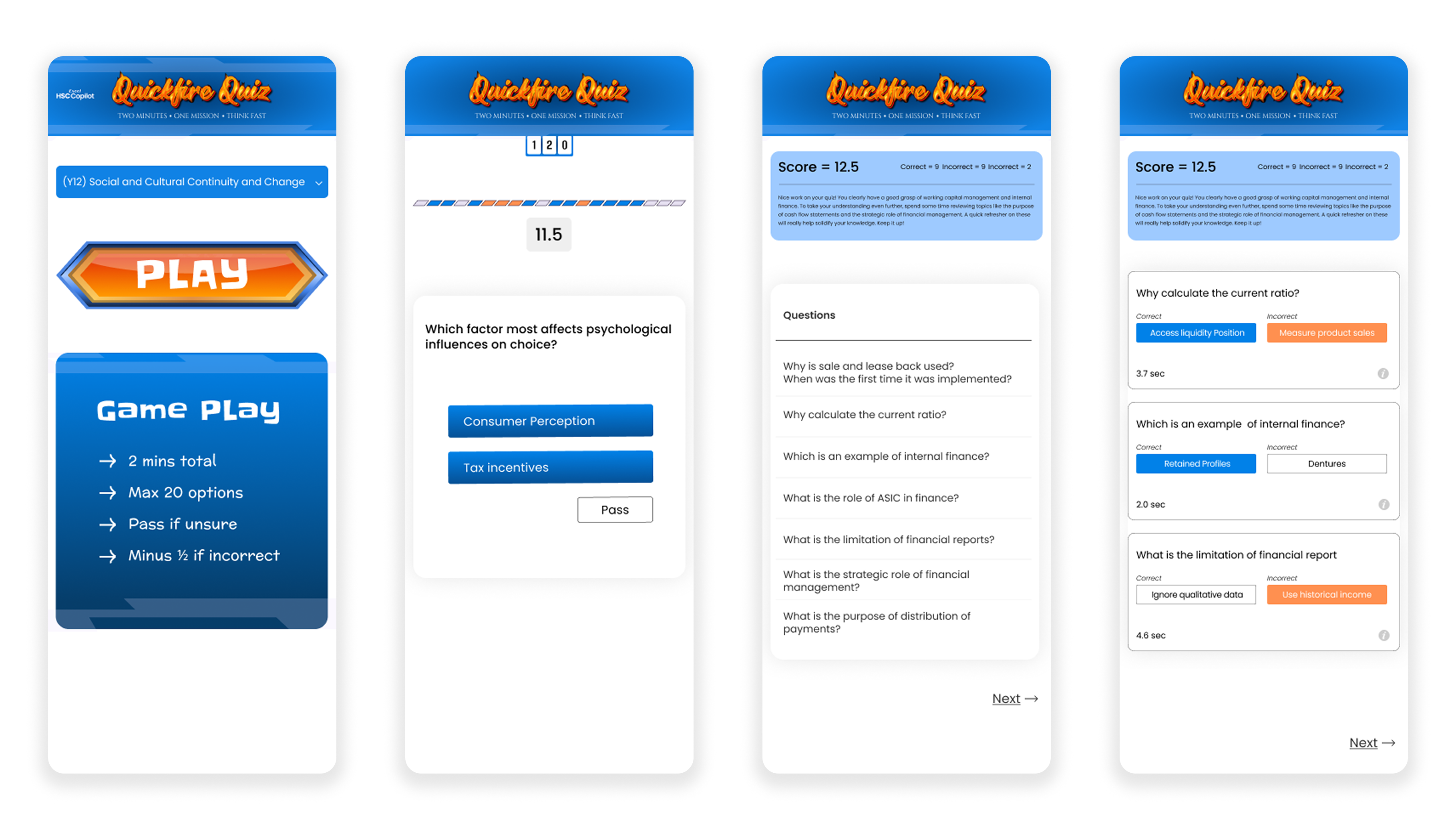
Internal Product · Quick Fire
Quick Fire is a fast-paced practice module designed to help students test knowledge quickly.
UX focus:
• Reduced visual noise to keep students in "answering mode"
• Clear separation between question, answer, and feedback
• Feedback designed to feel actionable, not intimidating
09
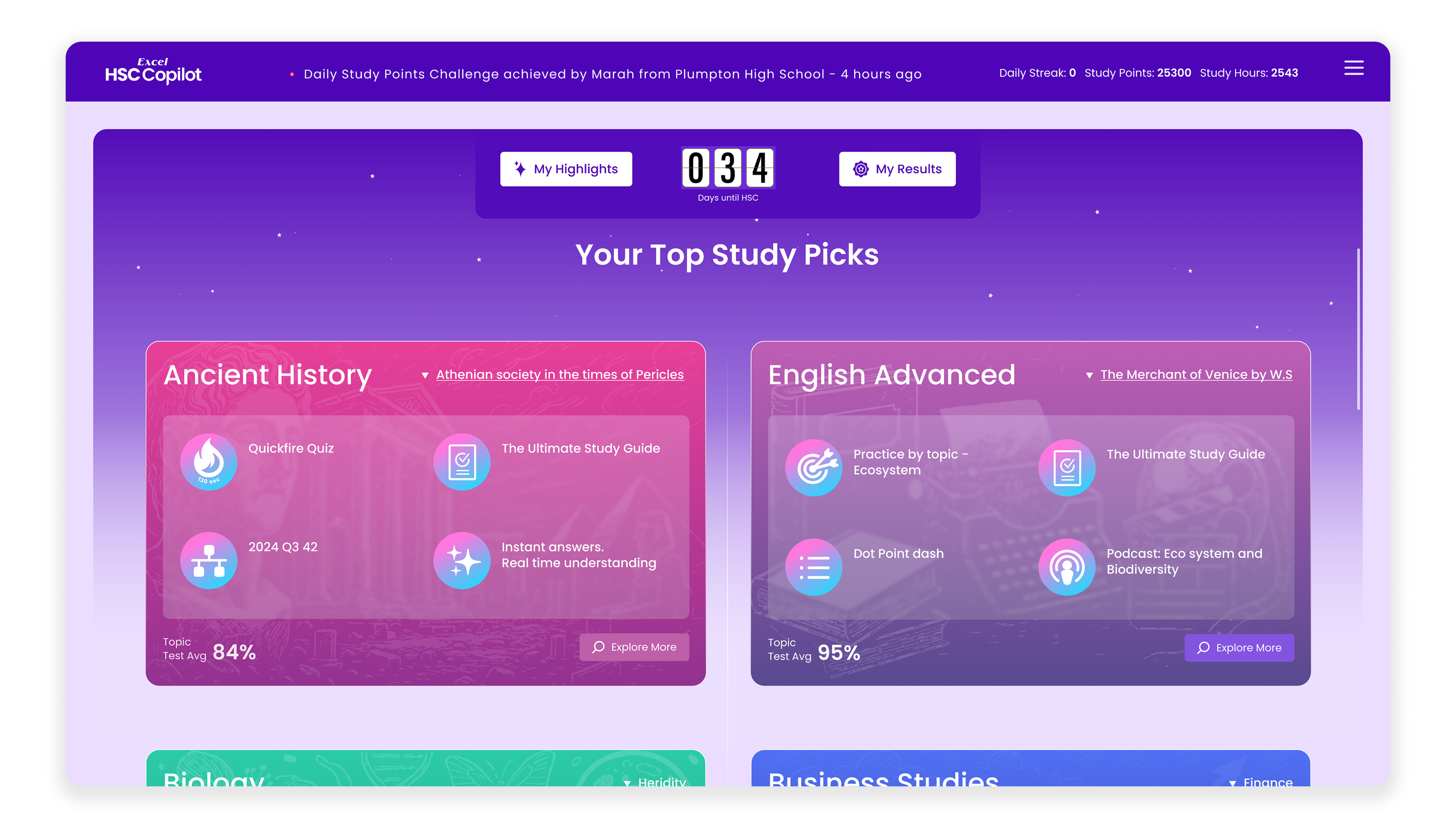
Other Internal Flows · Profile Section
UX focus:
• Streamlined navigation between practice, feedback, and progress
• Designed layouts to support long study sessions
• Maintained consistency with website design language
10
Constraints & Challenges
• Tight timelines with a 3-month project
• No dedicated research team
• High business impact with limited room for trial-and-error
• Designing complex educational logic without UI overload
• Creating a cohesive design language across the ecosystem
11
Reflection
This project strengthened my ability to:
• Design independently under pressure
• Translate complex systems into simple interfaces
• Balance business goals with user empathy
• Think at both feature-level and system-level