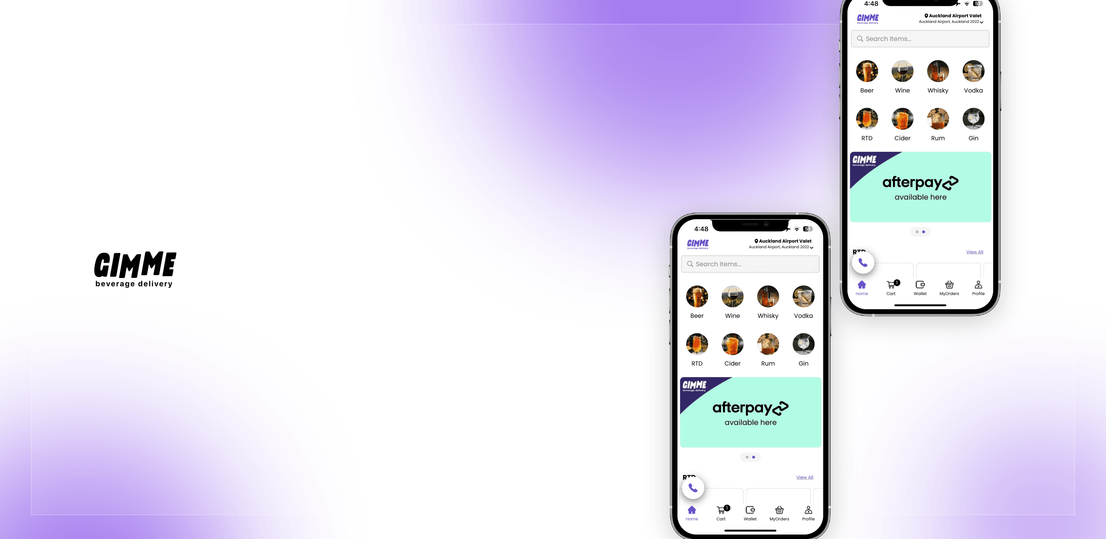
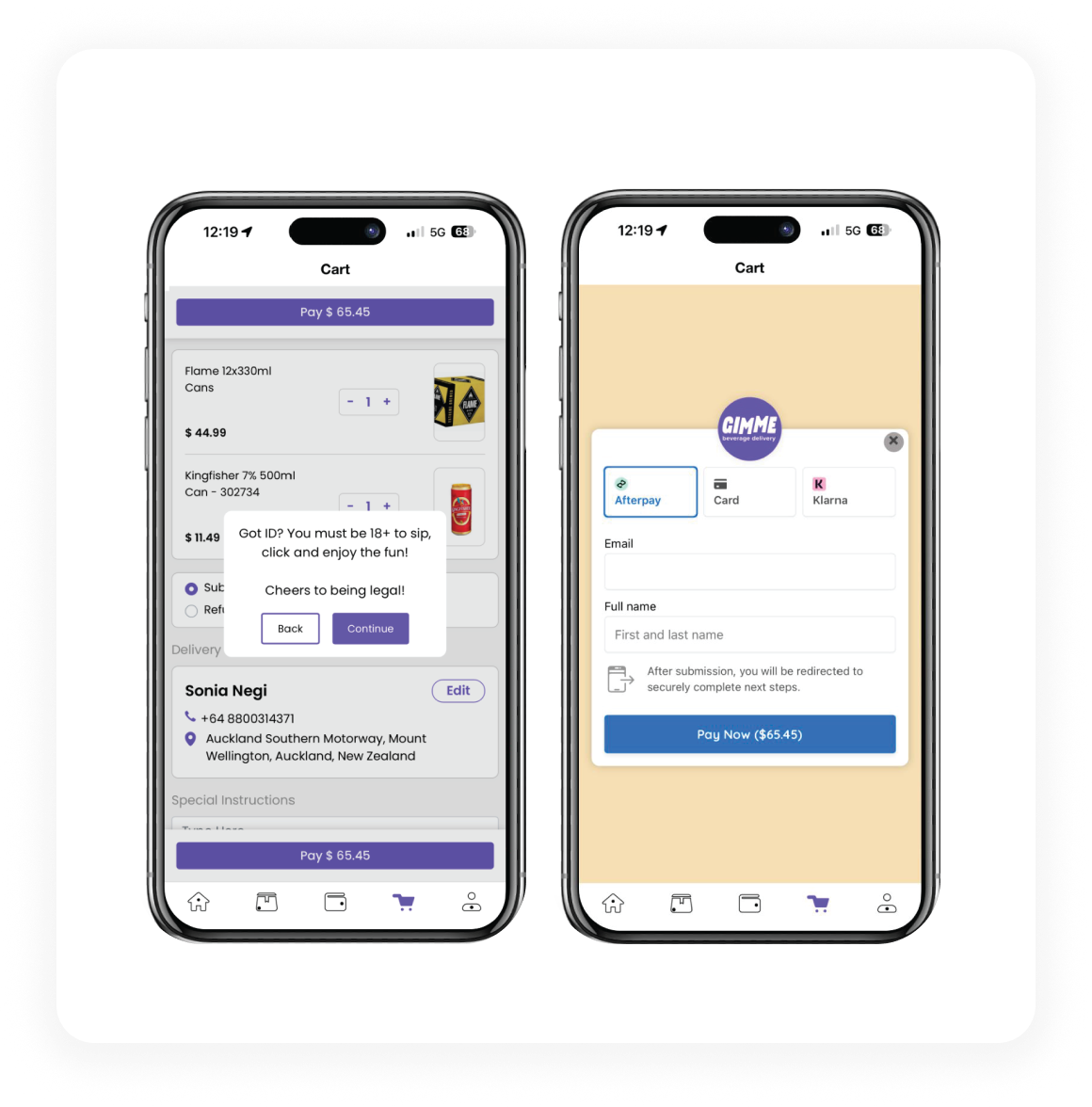
GIMME is an alco-bev delivery platform delivering alcohol within 45 minutes across Auckland, Christchurch, and Dunedin. I redesigned the mobile app and Shopify web experience end-to-end, improving trust, reducing friction, and supporting aggressive growth. The focus was on earning trust quickly, removing friction deliberately, and designing for real behaviour.
01
Overview
GIMME is an alco-bev delivery platform delivering alcohol within 45 minutes across Auckland, Christchurch, and Dunedin. With a catalogue of 6,000+ SKUs, GIMME differentiates itself through scale, speed, and convenience.
In 2024, GIMME underwent a critical transition, from a general beverage delivery app to a focused, alcohol-only platform. I was brought in to redesign the experience from a UI/UX perspective, improve trust, reduce friction, and support aggressive growth driven by marketing and city-level scaling.
02
My Role
I was the second and only the senior UI/UX designer on the project, working closely with developers.
My responsibilities included:
• Redesigning the mobile app experience end-to-end
• Structuring and executing the Shopify web experience
• Defining a consistent design language
• Working closely with developers on feasibility, performance, and rollout
• Improving product clarity, trust, and conversion
03
The Problem
When I joined, GIMME was already operational but the product experience wasn't supporting the business ambition.
Key Issues Identified:
• The brand had low trust recall: users didn't know GIMME well enough to confidently order alcohol
• UI felt inconsistent and fragmented due to lack of prior design ownership
• User journeys were not straightforward, especially on mobile
• App installs were low relative to marketing spend
• The app experience felt slow and cluttered
• The product still carried cues of a "general beverage app" rather than a focused alcohol platform
This created a disconnect: Marketing was driving traffic, but the product experience wasn't converting belief into action.
04
Business Context
• GIMME began scaling city-wise, with Auckland becoming the core market
• Marketing budgets doubled in Auckland as Auckland was the main base of our customer
• Acquisition via Meta ads, in-app notifications, emails, and wallet incentives showed traction
• Sales hit $40K NZD in November 2025 and continued growing at ~5% MoM
At this stage, UX was the bottleneck, not demand.
05
Design Goal
From a UX standpoint, the objective was clear: Turn GIMME into a product that feels credible, fast, and effortless, especially for first-time users.
This translated into four concrete goals:
1. Build trust instantly
2. Reduce cognitive load
3. Enable fast decision-making
4. Create a scalable, consistent system
06
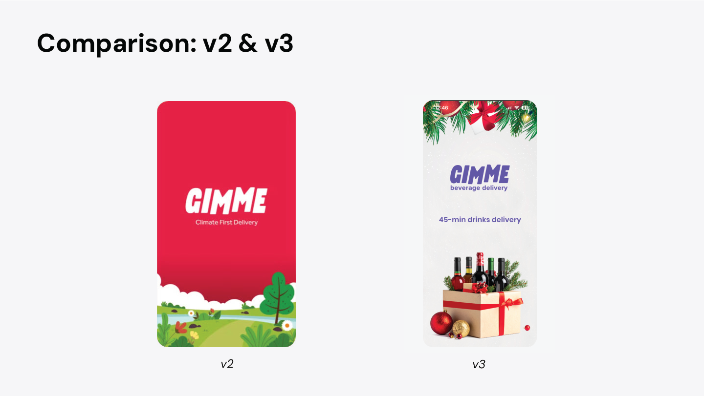
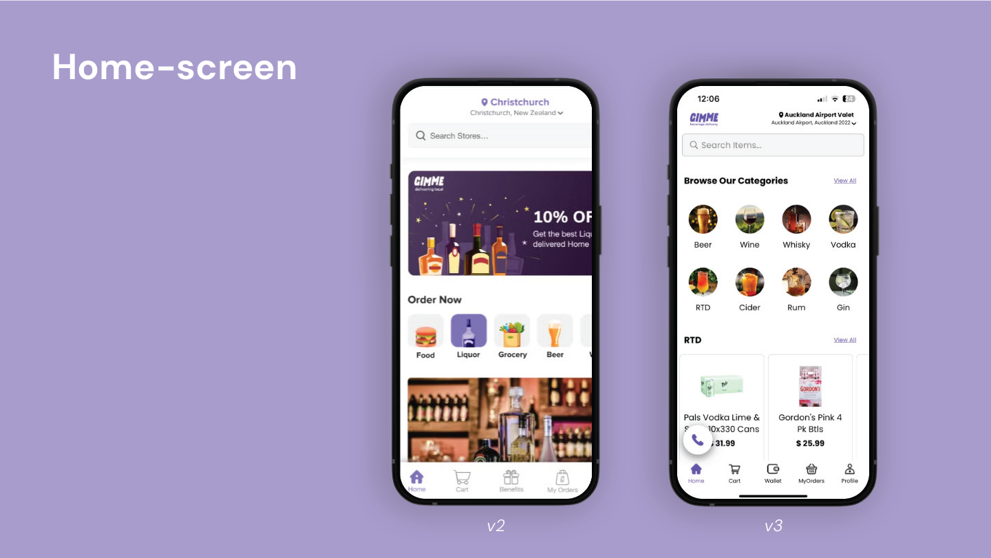
Before vs. After (v2→v3)
Before v2:
• Illustrative, playful UI with low credibility
• Cluttered screens competing for attention
• Generic delivery patterns borrowed from food apps
• Weak hierarchy and unclear primary actions
Splash screen
After v3:
• Alcohol-first identity
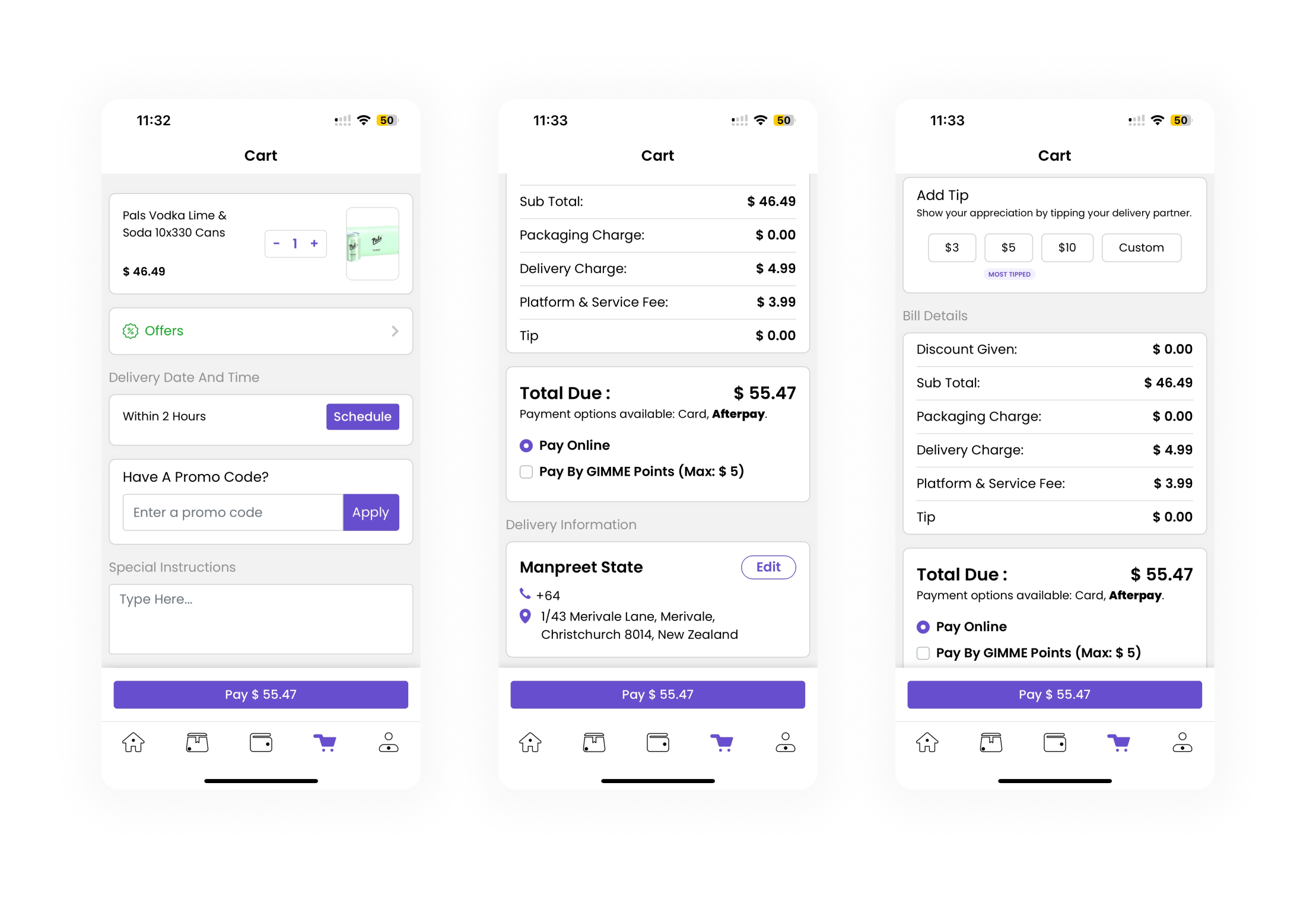
• Clear hierarchy and predictable flows
• Reduced visual noise
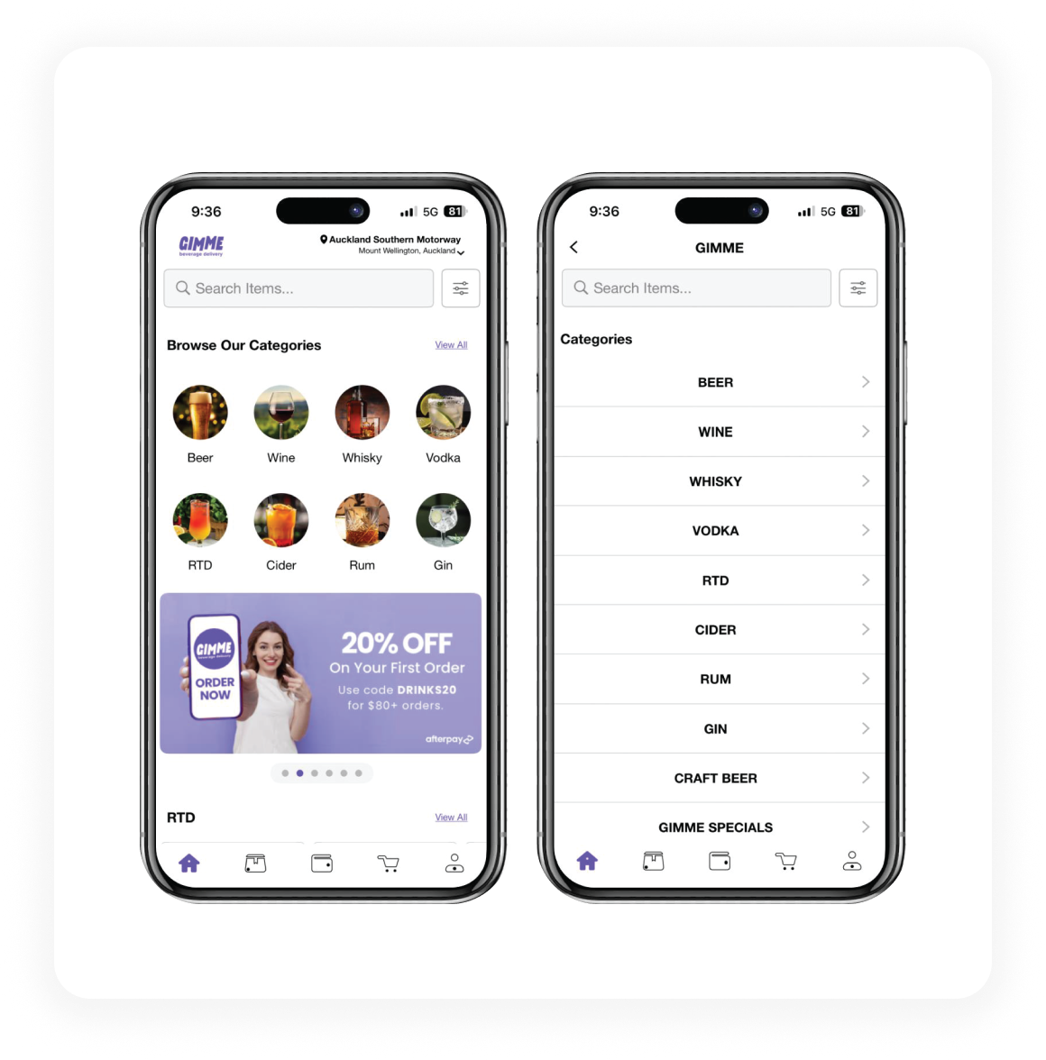
• Purpose-built navigation for alcohol discovery
08
Design Playbook (Philosophy)
I defined a design playbook that guided every decision.
1. Trust First
The UI must feel reliable before it feels fun.
2. Clarity Over Complexity
If something needs explaining, it needs redesigning.
3. Speed & Momentum
The experience should never slow users down.
4. Mobile-First Thinking
Spacing, navigation, and CTAs designed for thumbs.
5. Functional Minimalism
Minimal for focus, not aesthetics.
6. Consistency Builds Confidence
Predictable patterns reduce friction and build muscle memory.
Click the image to check the design playbook
09
Login and Onboarding
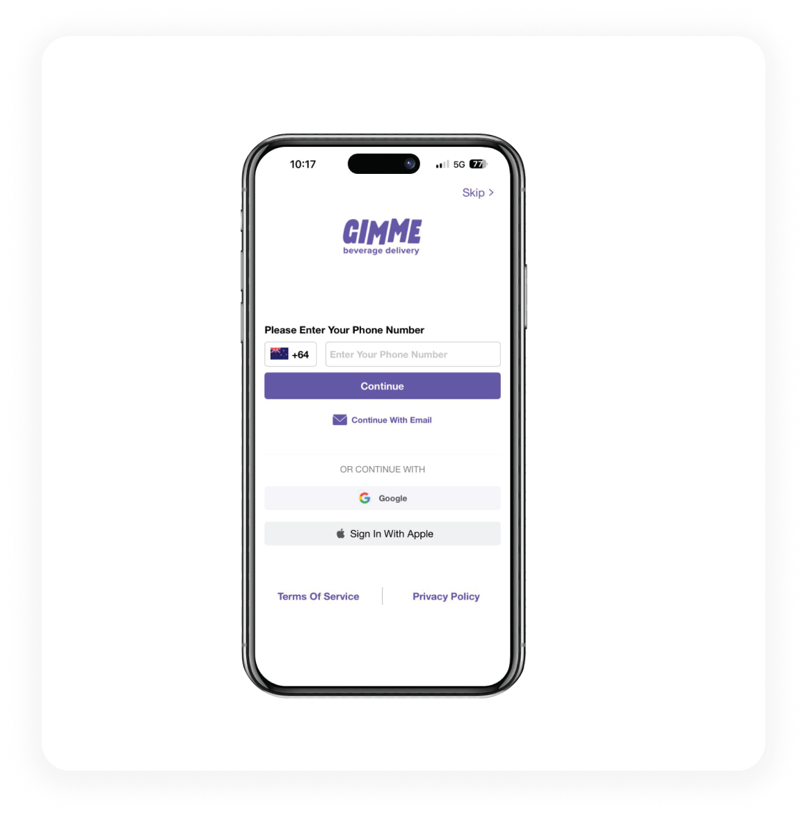
• Minimal phone-number first login along with email
• Optional social sign-ins
• No unnecessary steps
• Purpose-built navigation for alcohol discovery
10
Home Screen & Categories
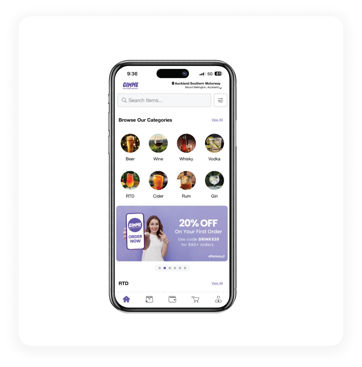
• Clear alcohol categories surfaced immediately
• Search always accessible
• Promotions placed after discovery, not before
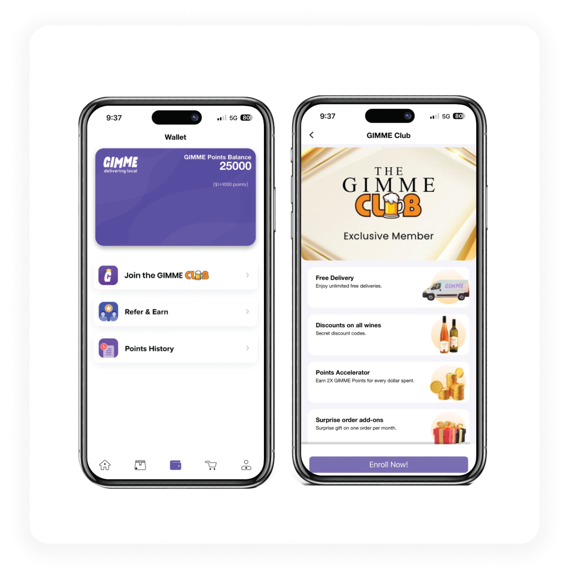
• Wallet positioned as a value center
• Clear points history
• GIMME Club framed as a premium benefit
15
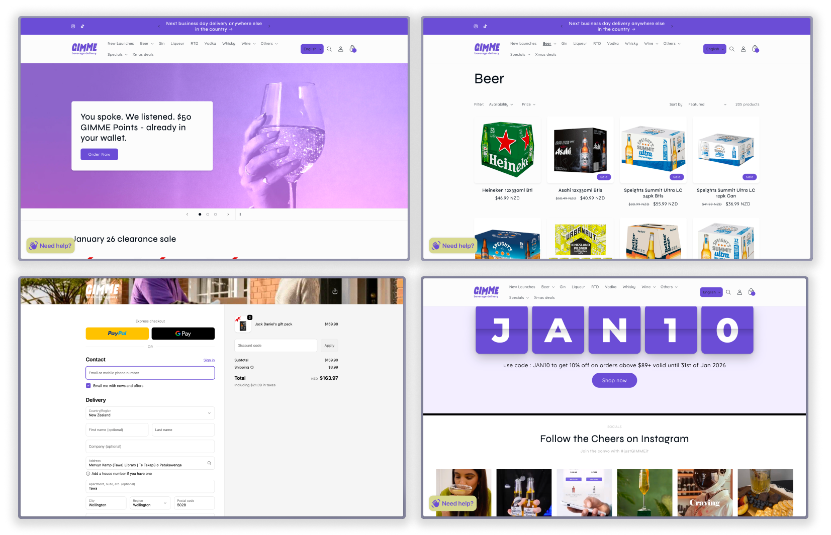
Shopify Web Experience
The Shopify site acts as the public-facing trust layer.
• Category-driven navigation
• Clear "45 min delivery" messaging
• Familiar ecommerce patterns
• Strong app download nudges
16
Impact
• Improved brand credibility
• Clearer user journeys
• Better alignment between marketing promise and product experience
• Created a scalable design foundation for future expansion
• Supported sustained MoM revenue growth
17
What I'd Improve Next
If given more time:
• Performance-focused micro-interactions
• Smarter personalization using order history
• Deeper design system documentation
• Stronger motion language for transitions
18
Closing Reflection
This project wasn't about visual polish. It was about earning trust quickly, removing friction deliberately, and designing for real behaviour, not ideal behaviour. GIMME taught me how much impact clear UX can have when a business is already moving fast.