A self-service chart builder for ESG risk data, designed as a grammar rather than a form
Year2026
RoleProduct Designer
Location38.7223° N, 9.1393° W
DisciplinesUX Systems Design, Data Visualization, Prototyping, Design Engineering
C-More is an AI risk-intelligence platform for non-financial risk (ESG, supply chain and governance) used by banks, agribusiness and manufacturers. Its dashboard could only be operated by the product team: charts were assembled blind, from a UI that mirrored the database schema. I redesigned it so a non-technical business user could build and edit their own charts, and built the redesign as a working prototype that stakeholders reviewed for three months. The result is a small grammar, where every fact is entity × indicator × time × value, the user chooses the question, and the system chooses the chart.
01
Overview
C-More sells intelligence about the risk a company cannot see in its own supply chain: emissions, water, labour, governance, supplier exposure. Its clients are banks and large agribusiness groups, and the data is hierarchical. A parent company owns divisions, divisions own operating units, and every level buys from external suppliers.
I joined as the designer on the dashboard redesign and owned it end to end: research, system model, interaction design, data visualization, the interactive prototype, and the developer handover. Roughly twenty review rounds ran between June and August 2026 with the head of AI, the software manager and a reviewer focused on chart interpretability.
Every round shipped as a single self-contained HTML prototype, deployed for the team to drive themselves rather than as a static mockup. That mattered: most of the real defects only appeared once someone put a thousand suppliers and a long legal name into a chart.
02
The Prototype
Every round shipped as one self-contained HTML file (inline CSS and JavaScript, deterministic synthetic data, no build step) deployed so stakeholders could drive it themselves instead of reading a deck. Feedback came back as screen recordings of people using it, which is the only way the scale problems ever surfaced.
The link below is the build the team reviewed. Two datasets are wired into it. The default demo carries two parent companies; adding ?data=full switches the same build to 48 entities with supplier clusters approaching a thousand nodes, long legal names included. That is where the caps, the thinning rules and the label logic earn their keep.
The existing build was an assembly tool wearing a dashboard's clothes.
• You built a dashboard out of sections of four fixed slots, and dragged indicators from a left-hand menu into them
• In edit mode charts rendered as grey placeholder boxes, so you could not see the chart until you saved and switched to view mode
• Categories were unlabeled icons; the copy used internal jargon like "Highest Hierarchy Company" and "Consolidated vs Granular"
• Comparison, the whole reason to open the thing, was buried behind an "Apply filters" button
The root cause was not any one of those. The interface mirrored the data schema, so only someone who already held the schema in their head could drive it. Every request for a chart went back to the product team.
So the thesis for the redesign: start from the user's question, not from a blank canvas and not from the schema.
04
The Model
Before any screens, I fixed the model the whole product would be built on. Every fact in the warehouse is one observation with four parts: entity × indicator × time × value.
That one sentence decides the chart shape:
• Hold entity and indicator fixed, vary time → line chart. "How is this changing?"
• Hold time and indicator fixed, vary entity → bar chart. "How do these compare?"
• Four indicators is the ceiling that stays legible on one pair of axes
The dashboard became a small, friendly grammar of graphics. The user chooses scope and chooses what varies; the system picks the shape. Nobody has to know what a chart type is called.
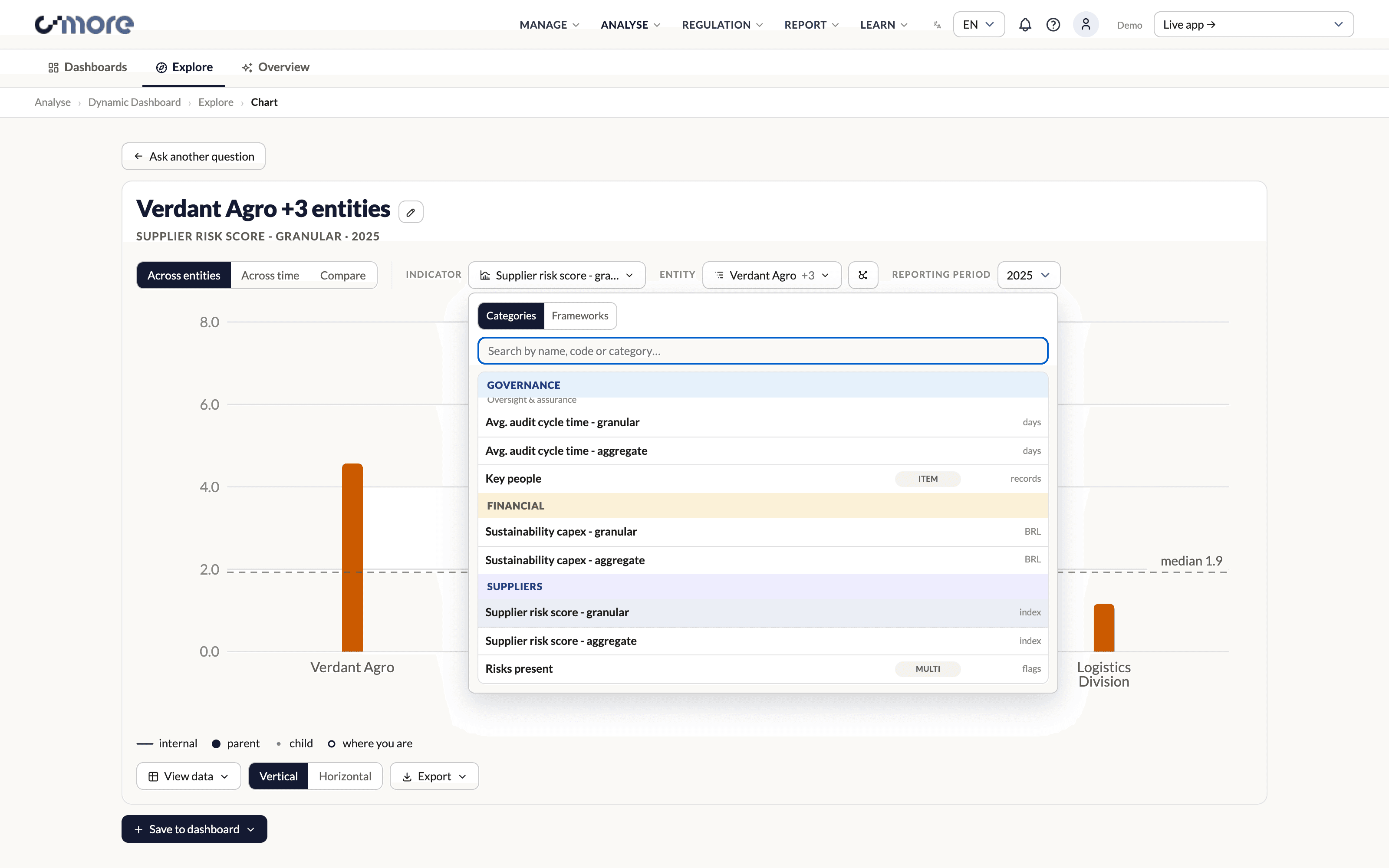
The indicator picker follows the same logic. Indicators are grouped by category or by reporting framework, searchable by name or code, and each row declares its unit and its data type, so an incompatible pick is impossible rather than merely discouraged.
Indicator picker: grouped by category or framework, searchable by code, unit declared on every row
05
One Selection State
The hardest part of the redesign was not a screen, it was a state.
The entity picker had to answer two different questions at once: which entities go on the chart, and how deep into the tree the chart reads. I first built those as two stores, membership and depth. They immediately disagreed. The summary pill said "+10" while the chart drew one bar, and every fix I sketched was a way of keeping two stores in step: auto-expand on tick, badge the hidden ones, count the drawn bars.
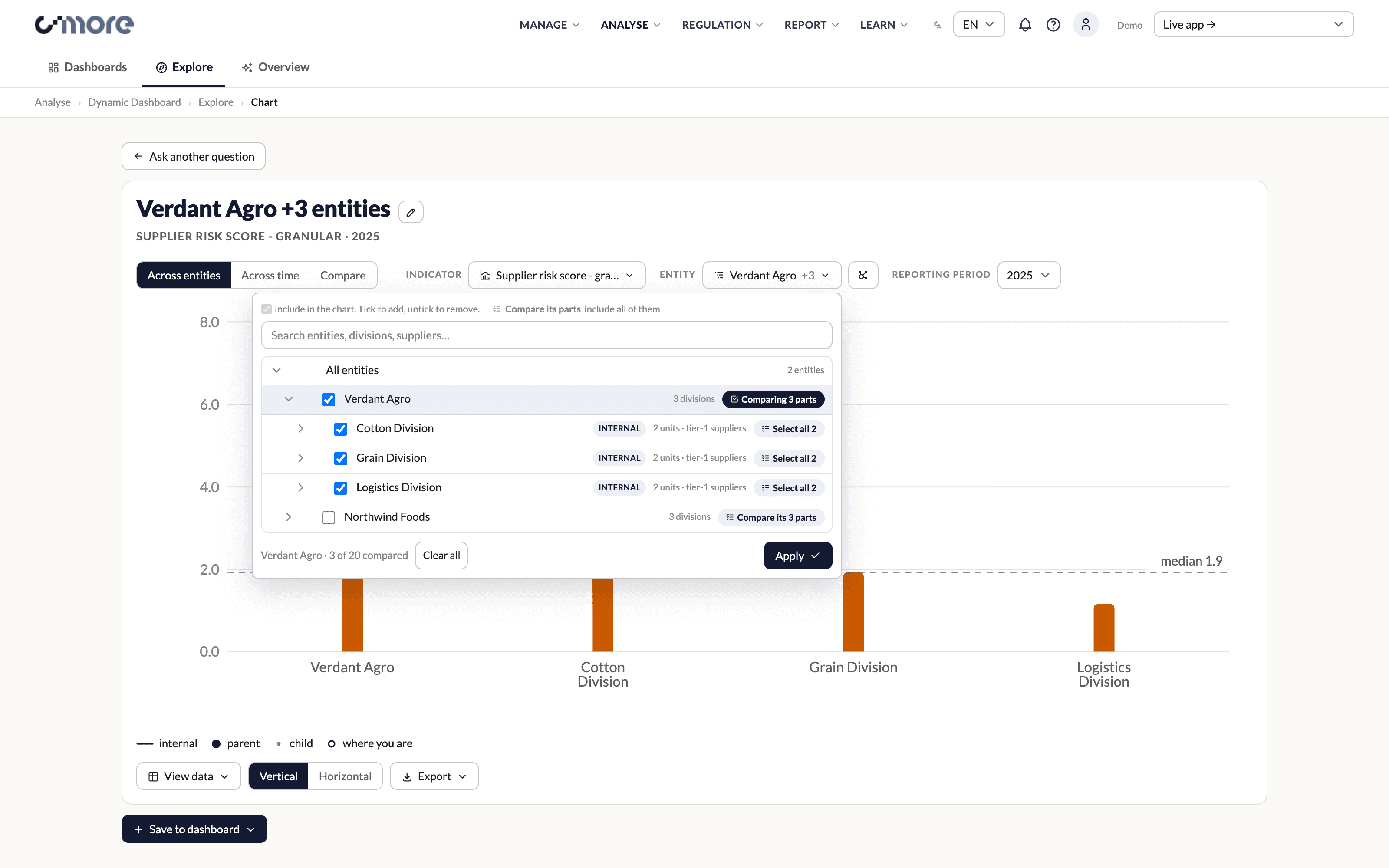
The real fix was to delete one of them. Depth is derivable from the selection, so there is nothing to reconcile. Standard tri-state checkboxes, a parent tick means "this branch as one rollup", partial children make the parent indeterminate, and the set of ticked leaves is the set of series.
The general rule I took from it: when a requirement is "these things must always agree", check whether one can be computed from the other before writing code to sync them.
Entity picker: tri-state selection over the org tree, where the ticked frontier is the chart
06
Two Doors, One State
Reviewers split on how they wanted to choose entities. One wanted a tree: dense, complete, scannable. Another wanted to see the shape of the network and click through it, because his recurring question was always "which entity am I looking at?"
Rather than pick a winner or build a mode switch, both surfaces write to the same selection state. The tree is the fast path; the map is for orientation, growing left to right, pannable, with a "you are here" node and the current comparison listed as chips underneath. Whichever door you use, closing it leaves the chart in the same state, and the two views can never disagree, because there is only one thing to disagree about.
Network view: the same selection, built by walking the graph instead of the tree
07
Aggregation Is Inferred, Not Toggled
An early round shipped an Individual | Combined toggle so users could say whether they were comparing entities or aggregating them. It was the wrong shape, and a whiteboard session made it obvious why.
Aggregation carries a hard mathematical invariant: the parts must sum to the parent. A toggle lets the user aggregate an arbitrary selection, three of five divisions, and the chart then shows a total that is quietly, invisibly wrong.
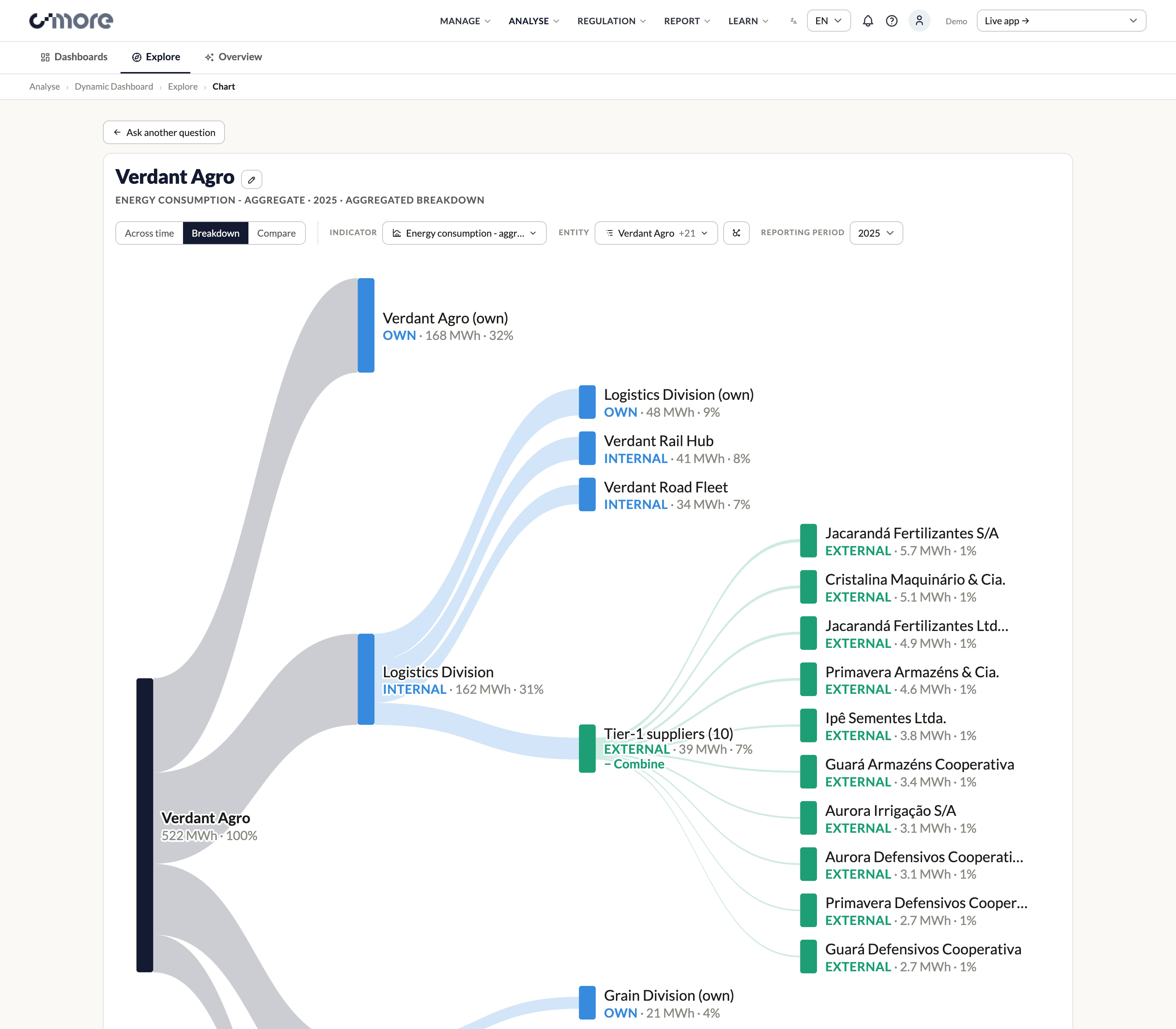
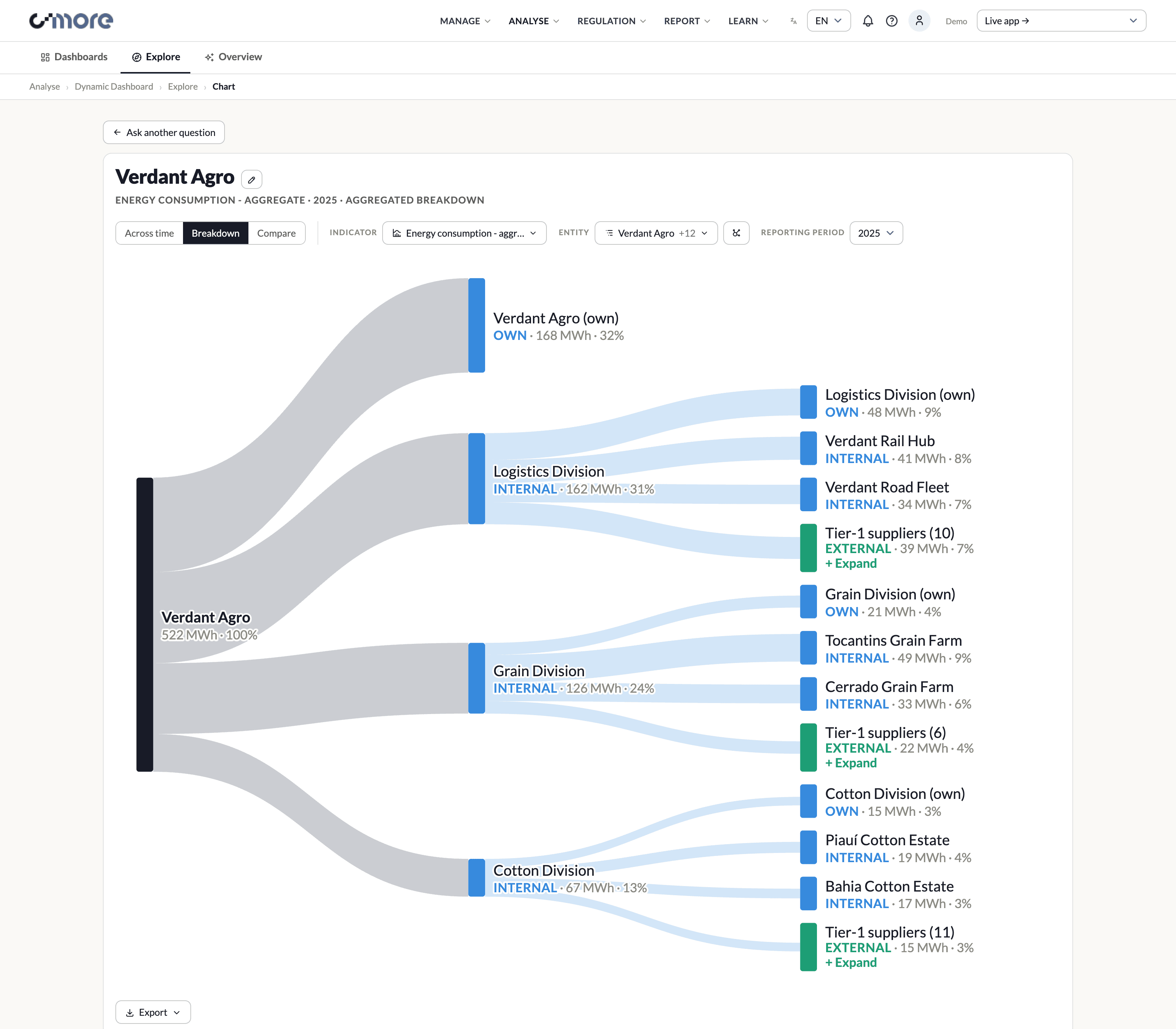
So the system infers it instead. Select a parent's complete direct-child frontier with an aggregatable indicator and you get the breakdown, a Sankey from the whole to its parts. Touch that selection (untick a child, add a peer, add a lone supplier) and it degrades automatically to plain entity comparison, because a partial rollup can no longer honestly claim to be one.
The user never sees a control for this. They see the chart change shape when the question changes shape.
Breakdown: the whole flowing into its parts, every node carrying value, share and realm
08
Colour Is Data, Not Decoration
Two questions competed for the same encoding channel: whose number is this, and what level of the org is it? Each round handed colour to one and took it from the other, until the answer turned out to be that they are different kinds of variable. Company is categorical, structural depth is ordinal, so they compose on one mark as hue × lightness and neither has to lose.
A third distinction was flatly discrete and got its own treatment: own operations, internal subsidiaries, and external suppliers are three realms, not three steps of one ramp.
All of it was computed, never argued. Palettes went through a contrast and colour-vision validator, and a pair that failed got replaced even after it had shipped for weeks. One lesson generalised: because hue here is keyed to an entity's identity rather than its position in a series, any two of forty-eight companies can appear side by side, so the palette has to pass all-pairs separation, not just adjacent pairs. That sized the usable palette at four, with everything beyond it folded into one declared grey.
Suppliers expanded: external contributors read as a separate realm, not a darker shade of internal
09
Relationships On The Label
Once a chart could hold a parent, its divisions and their suppliers at the same time, bars stopped being self-explanatory. Two adjacent bars might be siblings, or a parent and its own part, and the chart said nothing about which.
An early version made this a mode you could switch on. Two reviewers objected from what looked like opposite directions: one said the label should never be hidden, the other said the labels were eating the chart. Read as two asks they cancel out and invite a compromise nobody wanted. Read properly they were the same ask, that the label is always there but small. Neither of them was criticising the label; both were criticising the mode.
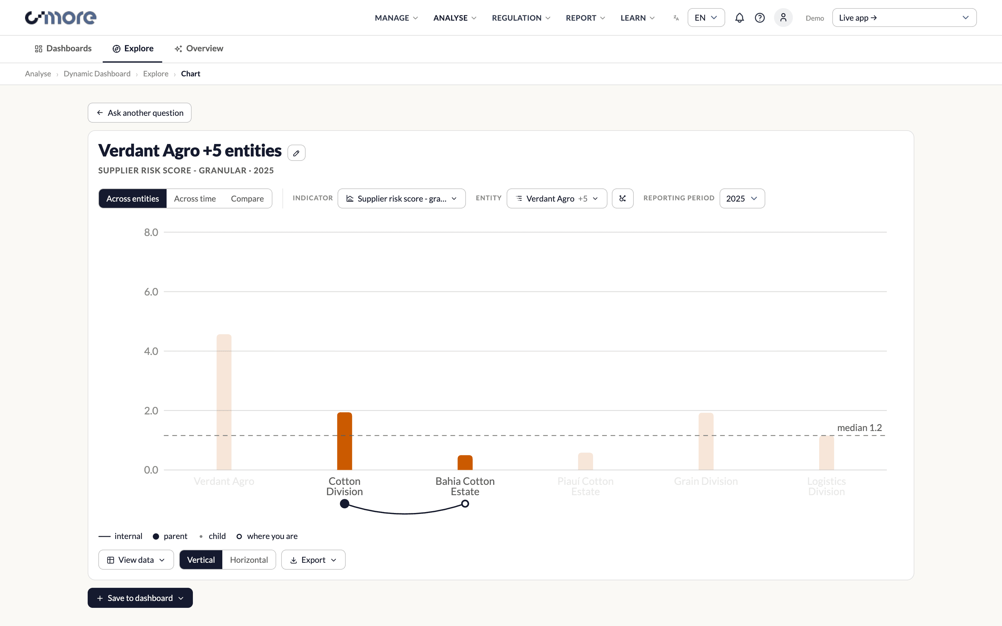
So the relationship moved into the axis label itself: a low arc under the two bars that are related, with a key in the legend. Always on, no control, no mode.
A relationship arc under the axis: parent, child and where you are, without a mode switch
10
What Changed
"Compare years" was a checkbox, "What changed" was a button, and the aggregate control had a segment for it too: three controls expressing one idea. They folded into a single Compare view that exposes two reporting periods, because a comparison is a view, not a modifier. One control added, two removed.
The chart itself is centred and diverging. Decrease runs to the left, increase to the right, with the before and after values printed beside each row and a scale across the top, added after a reviewer pointed out that the change chart had no scale at all and could only be read off its numeric labels.
The polarity colour came out. Whether an increase is good or bad is a property of the indicator, not of the chart, so the axis names the direction where that is defined and says nothing where it is not. A chart that already encodes change three ways does not need a fourth channel implying a judgement the data cannot support.
Compare: a diverging layout with a real scale, direction named at the axis instead of implied by colour
11
Designing At Scale
The standing critique from my manager was that designs look great in Figma and lose their usability the moment real data seeps in. So the prototype shipped with two synthetic datasets: a small demo, and a hostile one of 48 entities, supplier clusters approaching a thousand nodes, and long Brazilian legal names that break every label assumption.
What that forced:
• Hard caps on series, with the remainder folded into one declared group rather than silently dropped
• Label thinning and truncation rules that keep the words carrying the meaning, not the first six characters
• Smart supplier selection and group filters, because "tick 900 checkboxes" is not a selection model
• Grouped hover, where hovering a bar lifts its whole group and mutes the rest, so reading six suppliers' owners costs one hover instead of six
Verification matched. Logic checks ran in jsdom, and anything about layout, overlap, colour or "does this control actually exist on screen" was measured in a real headless browser. Several defects, including a control rendered outside its SVG, colliding labels and dead space, were only ever visible to a bounding-box measurement.
Supplier-level comparison: deep nodes still name their owner and keep their place in the hierarchy
12
Handover
The build went to the engineering team as a spec pack rather than a narrative: a behaviour spec, a data contract, design tokens, graph design rules, an assets-and-dependencies list, and a script that verifies every line reference in the documents still points where it claims to.
One limitation was stated rather than hidden. Division and supplier values in the prototype are concept data, deterministic, internally consistent and conserving correctly from parts to parent, but they are not a real rollup, and real numbers only arrive with the ingested org chart and value chain. Nothing in the pack presents them as real.
13
What I Took From It
The dashboard is the visible output; the durable output was a set of rules I now reach for by default.
• If two pieces of state must always agree, derive one from the other instead of syncing them
• When two reviewers contradict each other, check whether they are describing one requirement from opposite ends before designing a compromise
• A palette claim is only true if the validator says so, because "looks distinct enough" is not a finding
• Measure a regression against the build the reviewer actually saw, not against your working tree
• When a fix is getting elaborate, check whether the thing you are compensating for is itself a choice you can unmake
And the one that mattered most for the product: a system that silently adds and removes data to keep a chart tidy is less legible than one that shows an awkward but true chart and hands the user a control to fix it.