A checkout redesign for Atlys, a visa application platform serving 120+ destinations. The project focused on reducing customer anxiety during the payment step by addressing cost transparency, timeline uncertainty, and trust, resulting in a 10% conversion lift on desktop and 12% on mobile.
01
Overview
Atlys is a digital visa application platform that simplifies international travel documentation across 120+ destinations. The platform handles everything from e-Visas to sticker visas and appointment-based services, serving individual travelers and corporate clients from offices in San Francisco, New York, Dubai, and London.
I was brought in as a freelance UX designer to redesign the checkout experience, the final and most critical step in the visa application flow. The checkout screen is where users commit financially, and it was the biggest source of drop-off in the funnel.
Atlys Design Report: checkout redesign project
02
My Role
I worked as a freelance UX designer over the course of one month, collaborating with the in-house design and engineering teams at Atlys.
My responsibilities included:
• Auditing the existing checkout flow on both desktop and mobile web
• Identifying UX issues driving drop-off at the payment step
• Designing the redesigned checkout experience for desktop and mobile
• Creating annotated specs for the engineering team
• Iterating based on team feedback throughout the process
03
The Problem
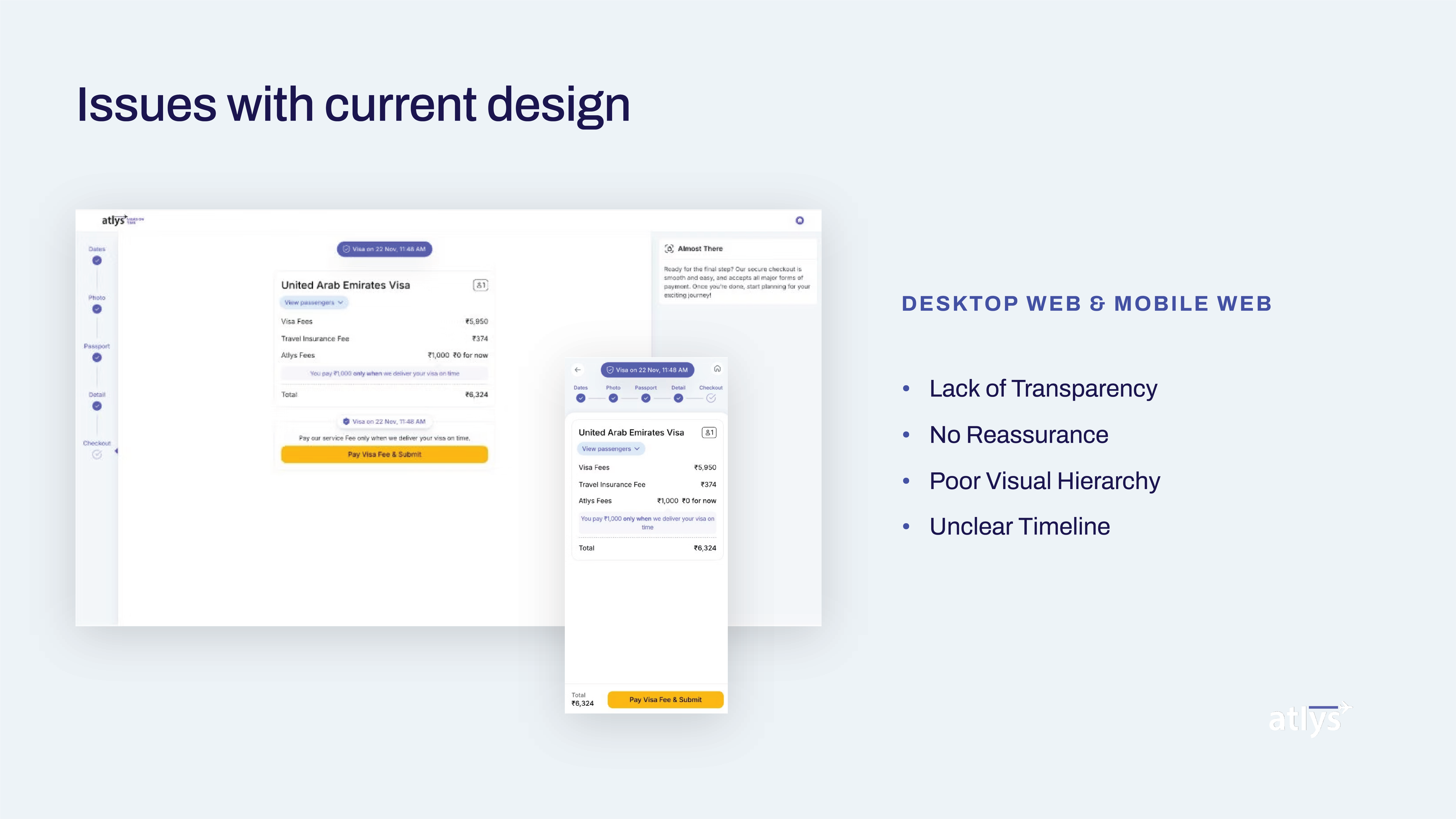
The existing checkout screen had several issues that were causing customers to abandon the visa application at the final step:
• Cost anxiety: the total amount appeared without context, leaving users unsure what they were paying for
• No reassurance: there were no trust signals, refund policies, or guarantees visible at the point of payment
• Poor visual hierarchy: critical information like total cost, delivery timeline, and the CTA were competing for attention with no clear reading order
• Unclear timeline: users had no visibility into when their visa would be processed or delivered
For a high-stakes purchase like a visa, where rejection means lost money and potentially cancelled travel plans, the checkout experience needed to actively reduce anxiety, not amplify it.
Issues with the current design: desktop and mobile web
04
Design Goals
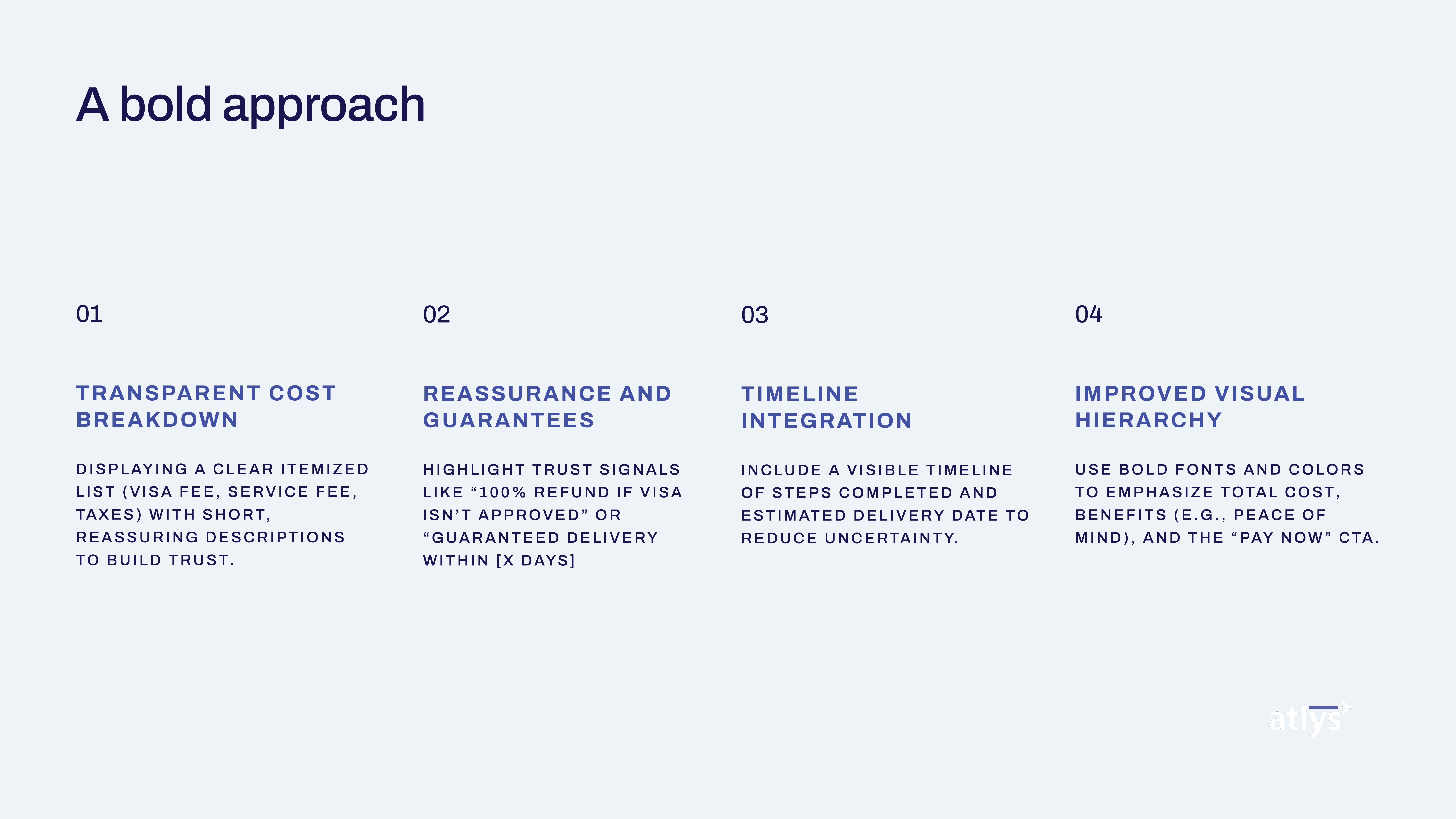
I defined four pillars that would guide every design decision:
1. Transparent cost breakdown: display a clear itemized list (visa fee, service fee, taxes) with short, reassuring descriptions to build trust
2. Reassurance and guarantees: highlight trust signals like "100% refund if visa isn't approved" and "guaranteed delivery within X days"
3. Timeline integration: include a visible timeline of steps completed and estimated delivery date to reduce uncertainty
4. Improved visual hierarchy: use bold fonts and colors to emphasize total cost, benefits, and the "Pay Now" CTA
The four pillars of the redesign approach
05
Desktop Checkout Redesign
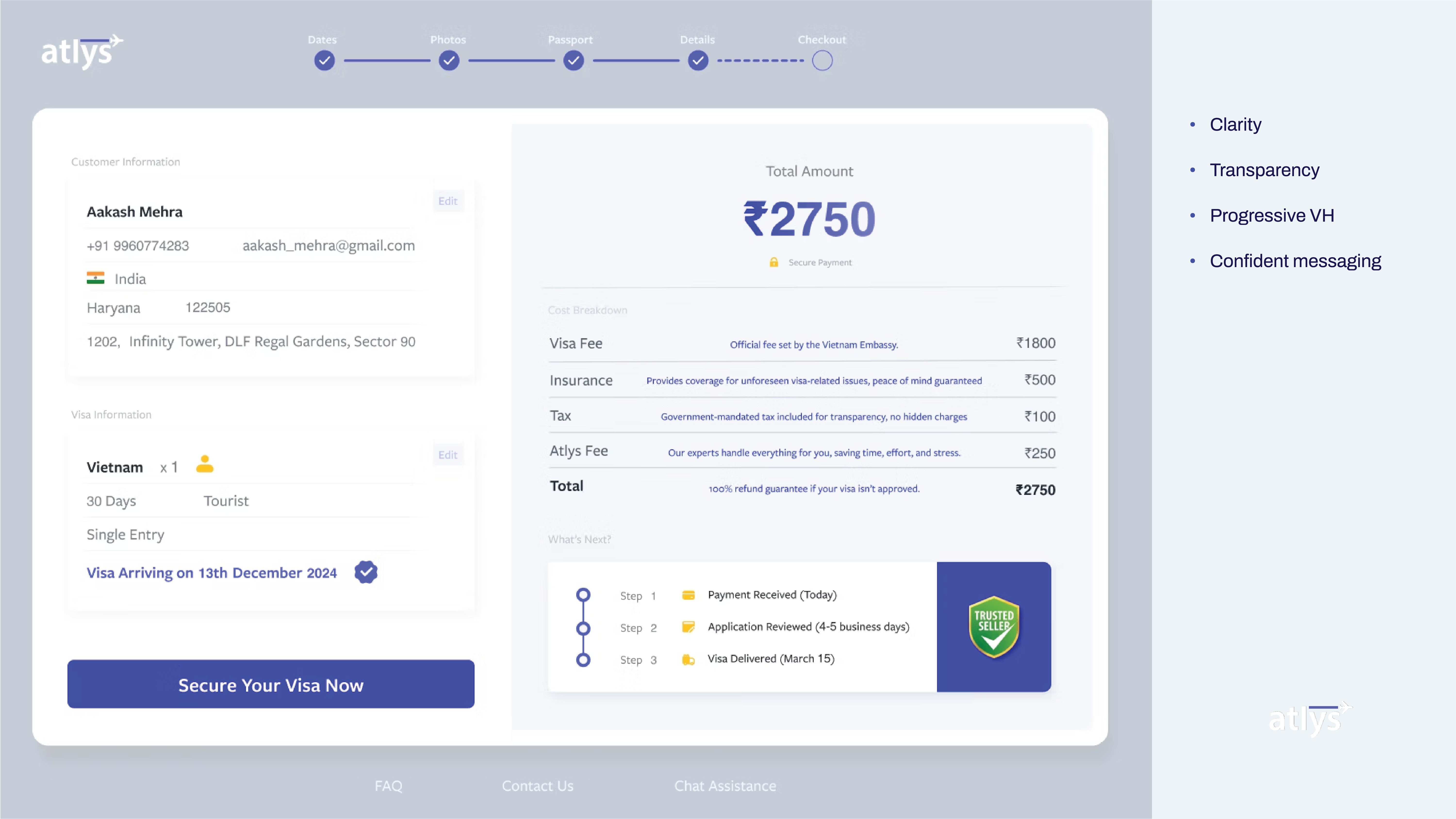
The desktop checkout was restructured into two clear zones:
• Left panel: applicant details, destination, visa type, and entry details. All the information the user has already provided, visible for confirmation
• Right panel: the payment zone with total amount prominently displayed, followed by an itemized cost breakdown with explanatory descriptions for each line item
Key additions:
• Each fee line includes a brief explanation (e.g., "Our experts handle everything for you, saving time, effort, and stress") to justify the cost
• A three-step timeline shows progress: Payment Received → Application Reviewed → Visa Delivered with estimated dates
• A trust shield badge reinforces the refund guarantee
• The CTA "Secure Your Visa Now" uses confident, action-oriented language instead of a generic "Pay"
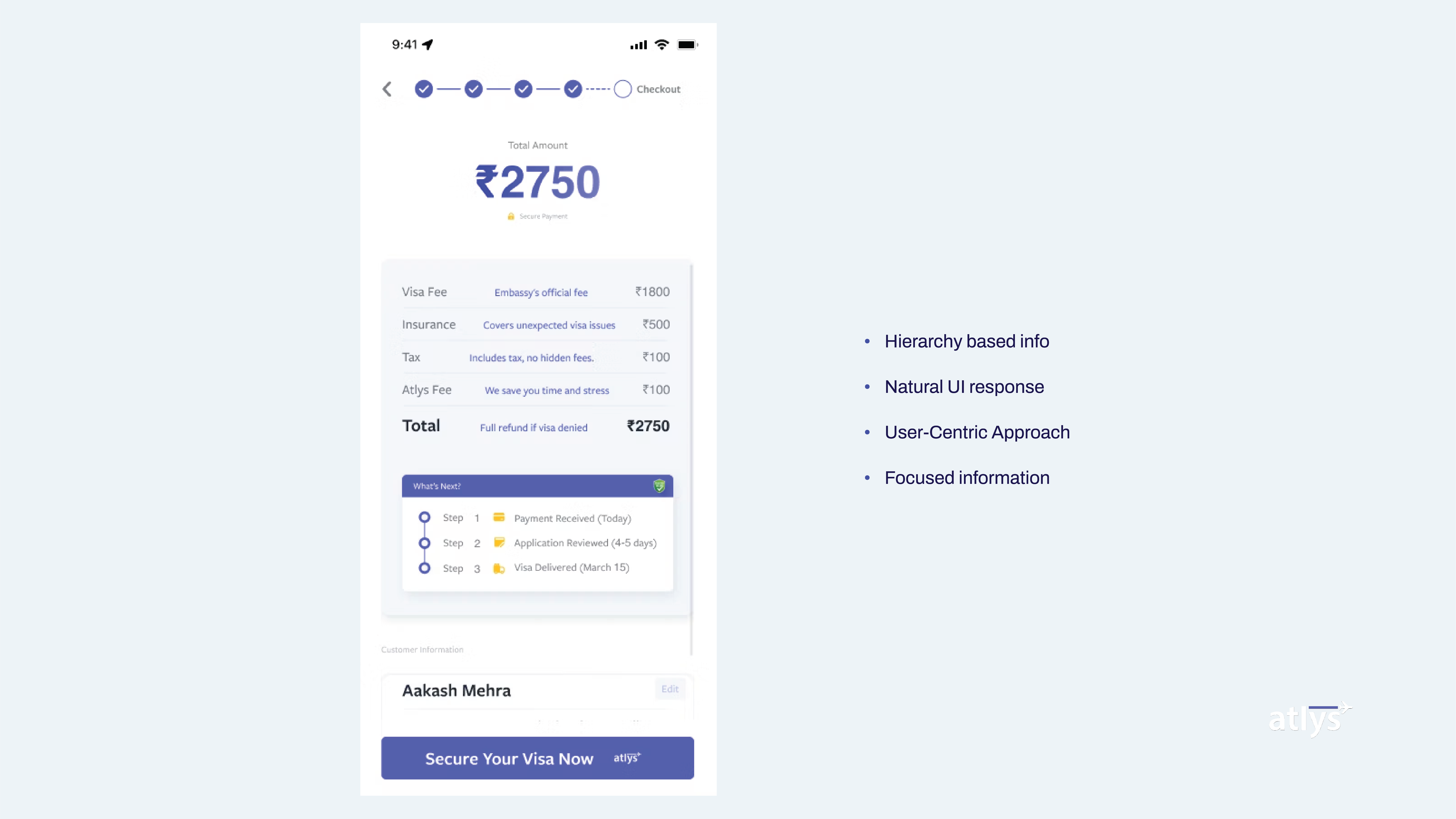
The mobile version required rethinking the layout for a single-column experience while maintaining all the trust-building elements:
• Total amount is the first thing users see: large, bold, unmissable
• Cost breakdown sits directly below with the same itemized explanations
• Timeline is condensed into a compact vertical stepper that still communicates progress and expected delivery
• Applicant name is surfaced near the CTA for a personalized touch
• The "Secure Your Visa Now" button is fixed at the bottom with the total amount visible alongside it
The design prioritizes hierarchy-based information delivery: users get the most important details first, with supporting information revealed as they scroll.
Redesigned mobile checkout: hierarchy-based info, natural UI response, user-centric approach
07
Summary
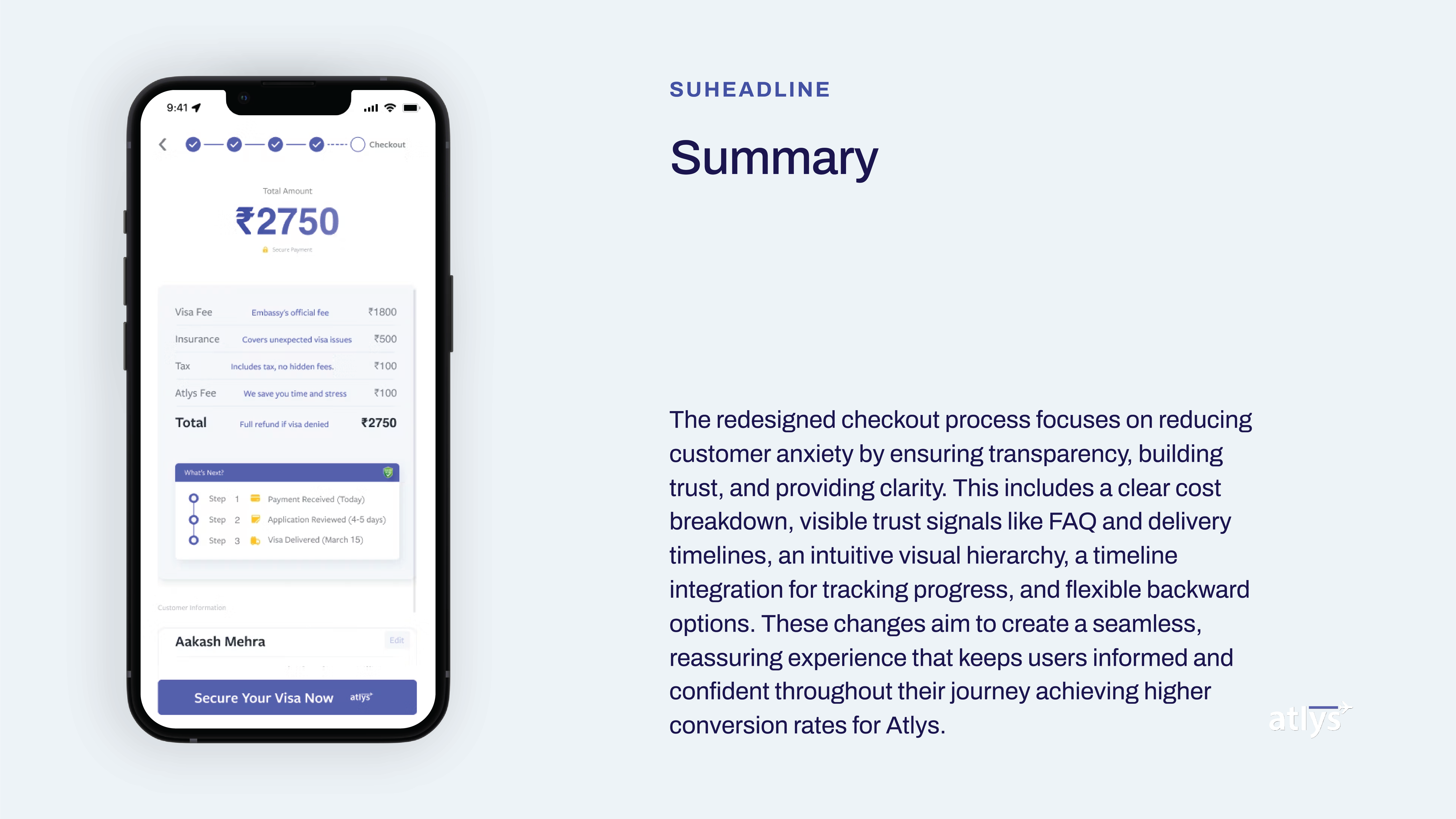
The redesigned checkout process focuses on reducing customer anxiety by ensuring transparency, building trust, and providing clarity. This includes a clear cost breakdown, visible trust signals like FAQ and delivery timelines, an intuitive visual hierarchy, a timeline integration for tracking progress, and flexible backward options.
These changes aim to create a seamless, reassuring experience that keeps users informed and confident throughout their journey, achieving higher conversion rates for Atlys.
Final mobile checkout design in context
08
Impact
The redesigned checkout delivered measurable results:
• 10% increase in conversion rate on desktop
• 12% increase in conversion rate on mobile
• Positive feedback from the Atlys team on the clarity and confidence the new design brought to the payment step
The improvements came from addressing the root cause of drop-off, anxiety and uncertainty, rather than just optimizing button placement or colors. By giving users transparency into what they're paying for, when they'll receive their visa, and what happens if something goes wrong, the design turned the checkout from a friction point into a trust-building moment.
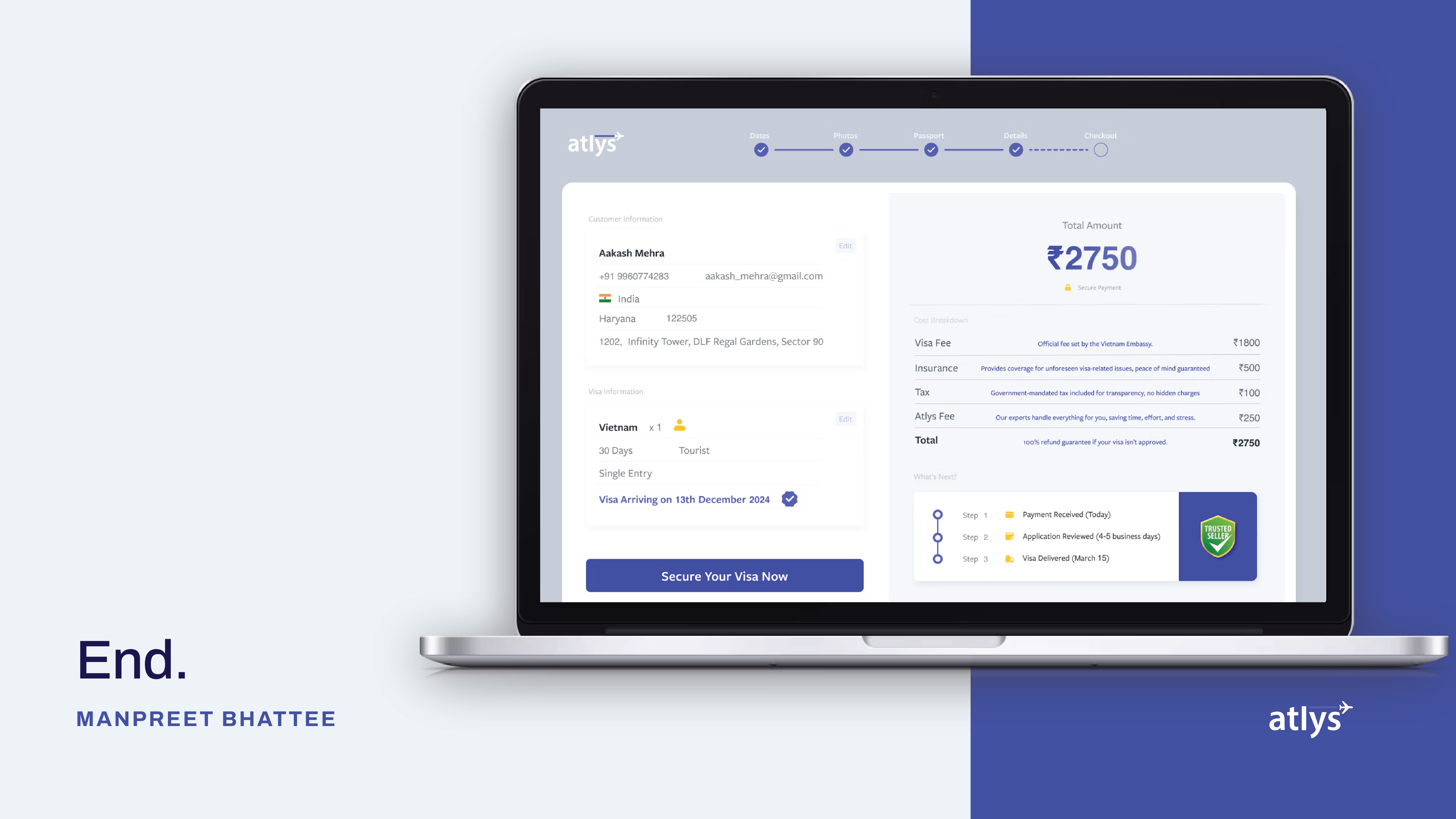
Final desktop checkout design: end-to-end redesigned experience
09
What I'd Improve
Looking back, there are areas I'd push further:
• A/B testing specific trust elements: while overall conversion improved, I'd want to isolate which trust signals (refund guarantee, timeline, cost descriptions) had the most impact to double down on what works
• Post-payment experience: the project scope ended at checkout, but the anxiety doesn't end at payment. A post-payment status tracking screen with real-time visa processing updates would complete the trust loop
• Localization: visa applicants come from diverse backgrounds. Testing the checkout with users across different countries and languages would reveal cultural differences in how trust and cost transparency are perceived